Time for the real deal 👊
Add a new Text content block in your scenario. It should look like this:
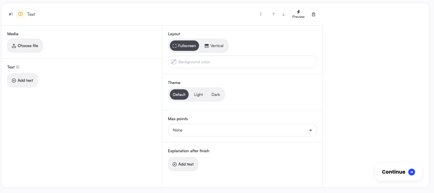 Each content block is divided in three columns.
The left column contains options that are unique to the content type, in this case a Header image and Text of the content block.
The middle column has options that are available for all your content blocks. You can for example award Points, or show an additional Explanation text after the user completes the content.
In the right column, you'll see a preview, to see what you're changing in real-time.
At the top of each scene, you have four options: Move content up, Move content down, Preview and delete.
🚀 Let's add some content to our Text scene: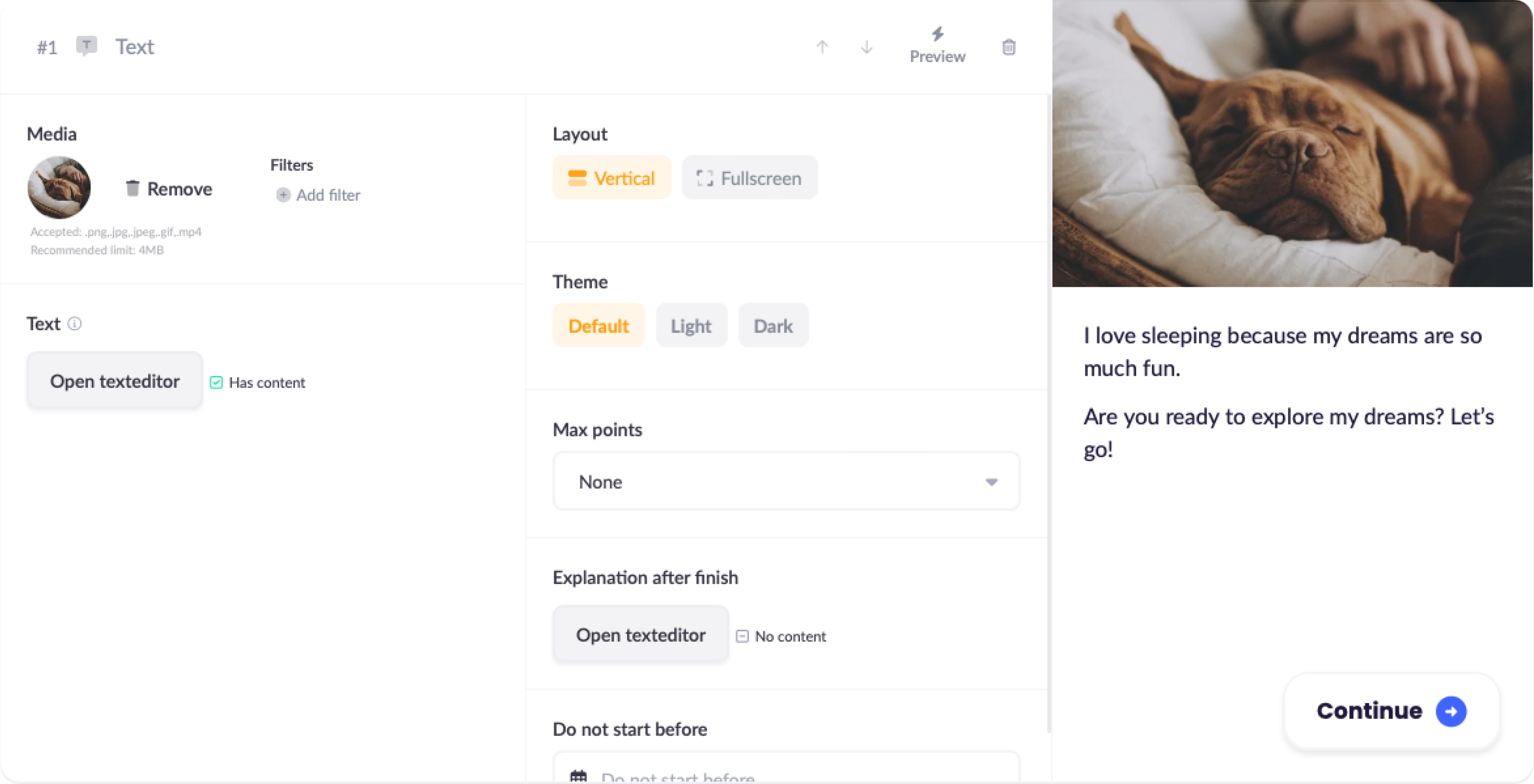
As you can see, the image and text appear in the Preview. Great work! 😊
Press the Preview button, and you can check out your newly created content on a real device:
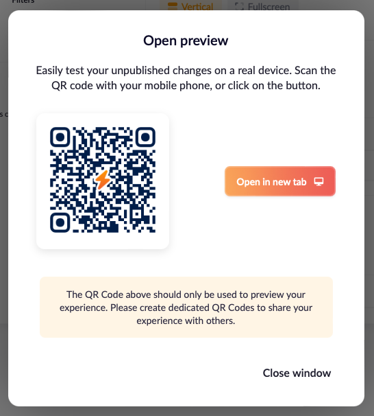
Either scan the QR code with your phone or open a new tab.
We now have a starting point for the experience, but it could use some interaction. Let's add a Multiple Choice content block:
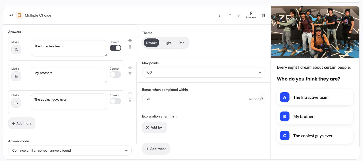
As you can see, a Multiple Choice content block is pretty similar to a text content block. Add a Question and a few Answers. Make sure to set one (or more) of your answers as the correct one.
Next, set Max points to 100 in the right column, and set the Bonus period to 30 seconds.
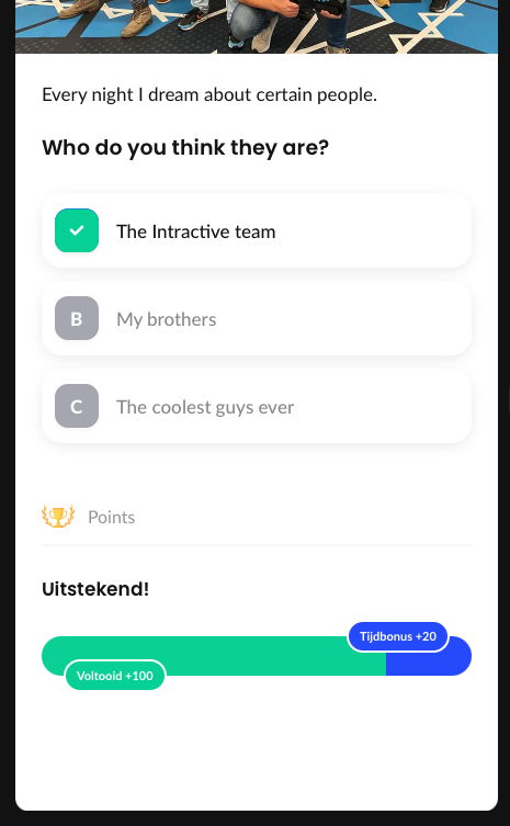
Let's test this scene by pressing Preview again. Try pressing the correct answer within 30 seconds, and you'll get some points 🏆:
Next up: let's add a Question or riddle scene.
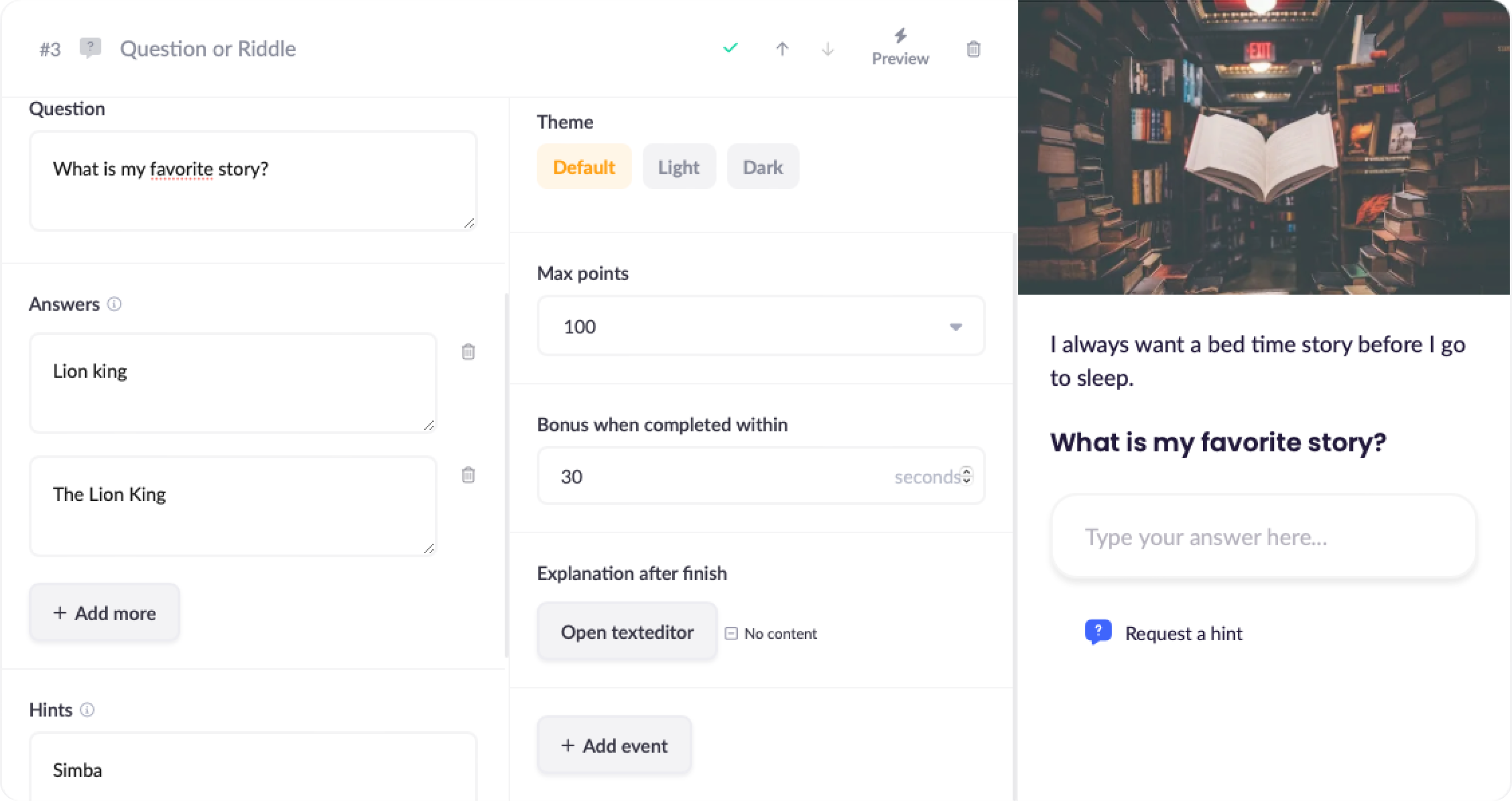
This should look pretty familiar by now. But instead of showing a list of possible answers, we now ask for the user to try and guess the correct answer using a text field.
In the Answers field, you can add multiple correct answers, mainly to account for larger spelling variations. You don't have to worry about any small typing mistakes your user might make. Small spelling mistakes are automatically detected, and the answer will still be counted as correct.
Make sure to add some Hints in case the user gets stuck on your question.